
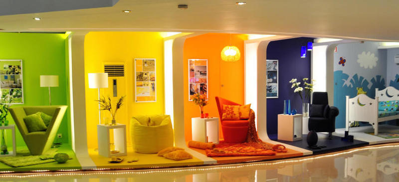
The colours of your home have a huge impact on your psychological well being whether you are aware of it or not. Every colour plays a different role, whether it is to excite or irritate you, or merely to sooth your senses. The different colours of each room not only fixes the theme, but sets the mood of the house. Here is PropSocial’s guide on how each colour affects you.
White / Off White / Beige
Bright colours are usually used in every house, as they give off a lighter, brighter and airier feel. The colour white is a good heat reflector, and is the perfect example of a neutral colour that doubles its use as making a place look pristine and clean.

But going pure white is not a good idea as it can get really glaring when the sun shines in, not to mention that the colour can be a little too stark and sharp.

Off white and beige or other shades of white closer to cream are better as they are softer colours which still give off the light and airy feel without it getting glaring.

Pink
This light and cheerful colour has always been the favourite of young girls and playful hearts. Choosing the right shade of pink is however vital as a darker shade may make you feel slightly claustrophobic or a tad too ‘pink’ when the curtains are closed!


A little known fact is that the colour pink may also bring you closer to the edgier side. It is said that companies in the United States that changed their light colours from fluorescent to pink for a ‘softer’ effect had their staff become more argumentative!

So if picking a pretty pink for your home, make it light and airy; don’t be too heavy handed on the shades.

Red
Red is one of the most vibrant colours in the range of human colours. It is a colour of anger, passion, volatility and even danger. Some love this colour for its exaggerated pulse while others find the walls ‘closing in on them’ when they are in a room of red. Although this is a favourite colour of many, lovers of this colour may want to avoid using this colour for their room… unless it’s for kinky purposes! ;)


Orange
Artistic and refreshing, orange is a bright and cheerful colour. Light orange coloured walls in the room brings an invigorating feeling.

A heavier orange on the other hand is a favourite colour of fast food chains, as the colour is said to stimulate appetite. Amongst some of the major food chains that use bright orange as their light colour is McDonalds, Wendy’s Carl’s Jr. and Burger King.

Blue
Blue is undisputedly the most calming of colours in the spectrum of colours. It brings a feeling of serenity and peace, similar to floating in a pool of water. This is one of the few rare colours that is ok to be heavy handed with.
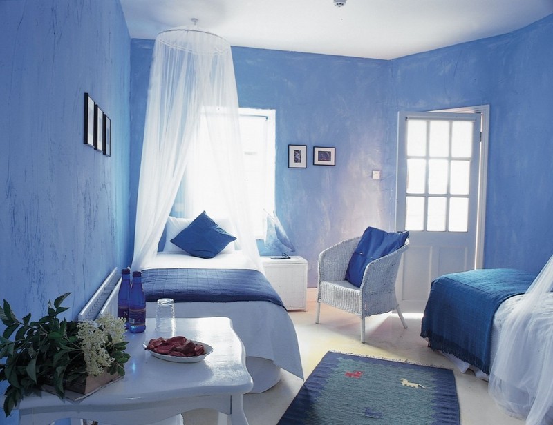
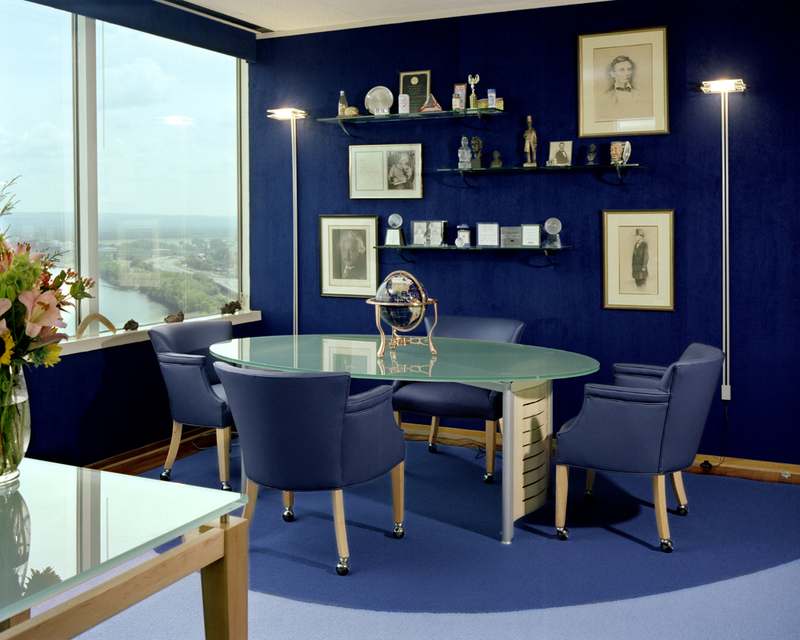
Another way to utilise this colour is by painting your walls a shade of white, beige or cream and off setting it with dark blue furniture.

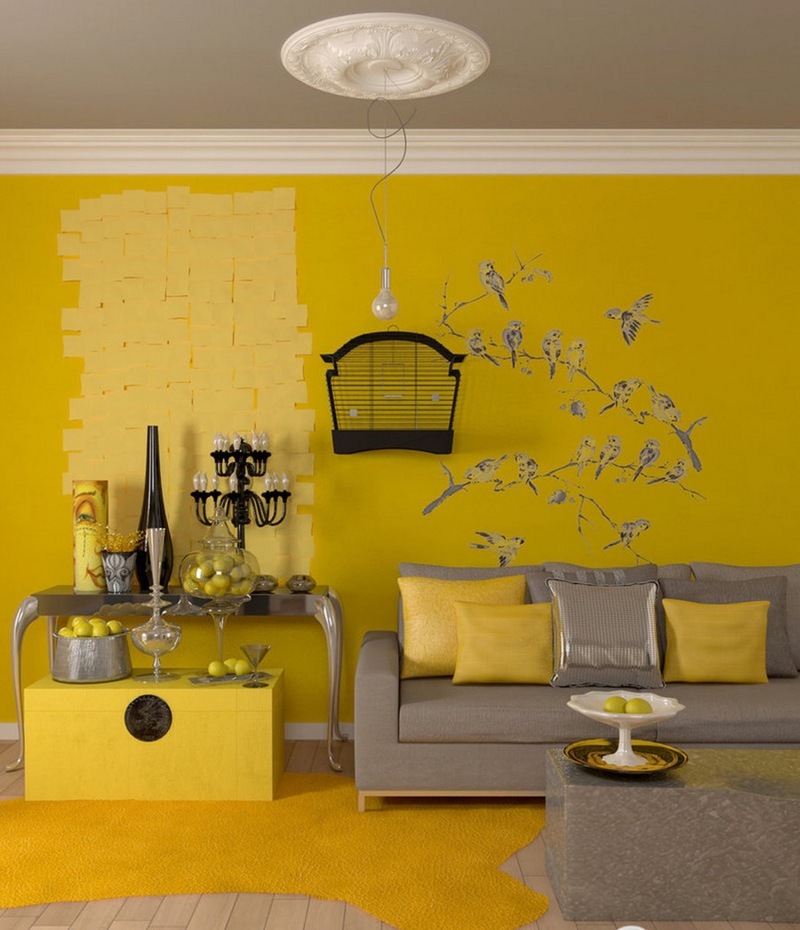
Yellow
Yellow is a cheerful colour that goes hand-in-hand with orange. This bright and happy colour cheers up a sad heart and lifts the mood of anyone. Painting your rooms light yellow will additionally lighten up the space without giving it the bright glare of pure white.


Green
Green is another one of the colours associated with peace and serenity. Observers will notice that the most relaxing colours are nature-oriented, green for the forests and blue for the ocean. Restful on the eyes, the colour green unwinds the soul and yet provides warmth at the same time.


Purple
This colour used to be associated with the British Royal Family in the past as a royal colour. It promotes an aura of sophistication, and is an all time rage in wedding colour themes.

It is however also a colour of restful quality which is also associated with creativity.

Another way to incorporate this elegant colour into your rooms is also to paint your room in a shade of off-white, beige or cream and offset it with shades of purple curtains, sofas, rugs and table runners.

Black
Black is undoubtedly a dark colour literally and figuratively. Rooms painted all in black is a colour that is often associated with mental depression, goth and problematic individuals which parents can even pass on to their children http://nationalreport.net/dear-jane-is-it-wrong-to-dress-my-children-in-gothic-attire/ !

It is however a necessary colour for recording rooms for complete light control.

Nevertheless, this oppressive shade is not a colour normal individuals will want to paint their houses or bedrooms in.

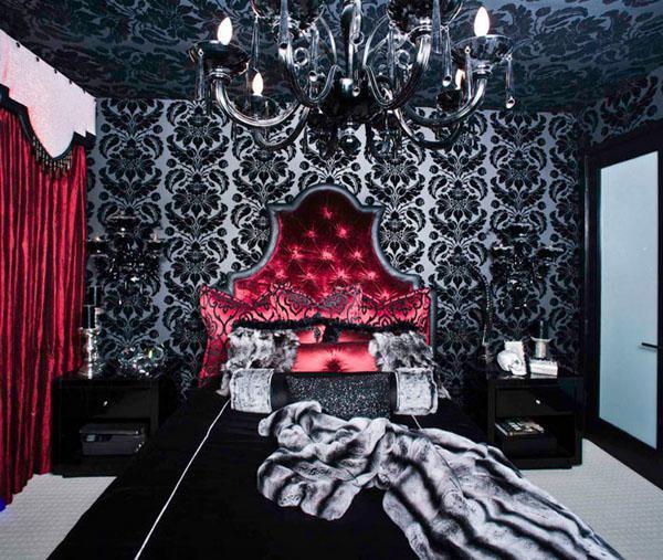
Although it can also be quite a coolly elegant colour if used well.

Conclusion
So as for what is the best colour for your home? It really depends on your and your preferences. After all, one man’s meat is another man’s poison.

(Written by: Diane Foo Eu Lynn, 25th March 2016)


